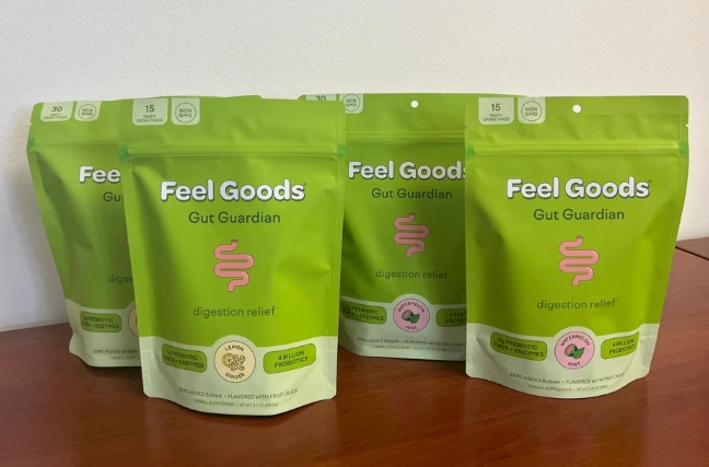
When it comes to designing supplement packaging, every detail matters. From colors to graphics to fonts, all elements play a crucial role in communicating the product’s benefits and attracting consumers.
Capturing Attention with Color
Color is one of the first things consumers notice about a product. Bright, bold colors can grab attention and convey energy and vitality. Green is often used to signify health and wellness, while blue communicates trust and reliability.
Engaging with Graphics
Graphics can visually depict the benefits of a supplement, such as increased energy or improved focus. Images of fresh fruits and vegetables can suggest natural ingredients, while photos of active individuals can convey vitality and strength.
Enhancing Readability with Fonts
Fonts should be easy to read and reflect the product’s brand identity. Clean, modern fonts suggest a sleek and professional image, while cursive fonts can evoke a sense of elegance and sophistication.
Emphasizing Important Information
Key product information, such as ingredients, dosage instructions, and benefits, should be prominently displayed on the packaging. Use bold fonts or colors to make this information stand out and be easily accessible to consumers.
Creating a Cohesive Design
A cohesive design is essential for creating a strong brand identity. Consistent use of colors, graphics, and fonts across different products within a supplement line can help consumers easily identify and remember the brand.
In conclusion, the science of supplement packaging design is all about effectively communicating the product’s benefits and attracting consumers. By carefully considering color, graphics, fonts, and overall design, supplement manufacturers can create packaging that not only looks appealing but also effectively conveys the product’s value and benefits.

