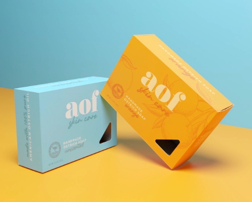
Soap packaging is an essential part of branding and marketing for any soap product. A creative and eye-catching soap packaging design can make a product stand out on the shelf and attract customers. Here are 10 creative soap packaging designs that are sure to catch the eye of consumers.
1. Bold Typography
Using bold and unique typography can instantly grab the attention of consumers. Bold and colorful fonts can make the packaging design pop and stand out on the shelf.
2. Minimalist Design
Less is often more when it comes to packaging design. A minimalist design with clean lines and simple colors can add a sense of sophistication and elegance to a soap product.
3. Organic Shapes
Using organic shapes and patterns in soap packaging design can create a natural and eco-friendly vibe. Incorporating elements like leaves, flowers, or waves can give a product a fresh and clean look.
4. Transparent Packaging
Transparent packaging can showcase the beauty of the soap itself. Clear packaging allows customers to see the color and texture of the soap, making it more appealing and enticing.
5. Hand-drawn Illustrations
Hand-drawn illustrations can add a personal touch to soap packaging. Quirky and playful illustrations can create a sense of charm and whimsy that will attract customers.
6. Vintage-inspired Design
Vintage-inspired designs can evoke a sense of nostalgia and retro charm. Using vintage typography, patterns, and colors can give a soap product a timeless and classic look.
7. Sustainable Materials
Using sustainable and eco-friendly materials in soap packaging design can attract environmentally-conscious consumers. Materials like recycled paper, cardboard, or biodegradable plastic can show a commitment to sustainability.
8. Unconventional Shapes
Breaking away from traditional rectangular soap packaging, using unconventional shapes can make a product stand out. Circular, hexagonal, or triangular packaging can create a unique and memorable look.
9. Metallic Accents
Adding metallic accents like foiling or embossing to soap packaging can add a touch of luxury and elegance. Gold, silver, or copper accents can make a product look high-end and premium.
10. Playful Patterns
Incorporating playful patterns like polka dots, stripes, or geometric shapes can add a fun and playful vibe to soap packaging. Colorful and bold patterns can make a product visually striking and memorable.
Overall, creativity and innovation are key when it comes to designing soap packaging that stands out on the shelf. By incorporating unique typography, minimalist design, organic shapes, transparent packaging, hand-drawn illustrations, vintage-inspired design, sustainable materials, unconventional shapes, metallic accents, and playful patterns, a soap product can attract customers and make a lasting impression.

