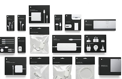
Apple’s innovative packaging designs have evolved over the years to not only protect their products, but also create a memorable and enjoyable unboxing experience for customers.
Minimalist Beginnings
In the early days, Apple’s packaging was simple and clean, focusing on a minimalist design aesthetic that reflected the company’s commitment to simplicity and ease of use.
Focus on Eco-Friendly Materials
As environmental concerns became more pressing, Apple shifted towards using more sustainable materials in their packaging. They began to use recycled paper and soy-based inks, reducing their impact on the environment.
Innovative Unboxing Experience
Apple revolutionized the unboxing experience by paying attention to even the smallest details. From the satisfying sound of opening the box to the way each product is nestled carefully inside, they ensure that every step of the unboxing process is a delight.
Emphasis on Functionality
Apple’s packaging is not just aesthetically pleasing, but also highly functional. It is designed to protect the product during shipping and storage, while also being easy to open and recyclable.
Continued Innovation
Apple continues to push the boundaries of packaging design with each new product release. They experiment with new materials, shapes, and textures to create a unique and memorable unboxing experience for their customers.
Overall, Apple’s packaging designs have come a long way from their minimalist beginnings, evolving into a key part of the brand’s identity and customer experience. By focusing on sustainability, functionality, and innovation, Apple sets the standard for packaging design in the tech industry.

