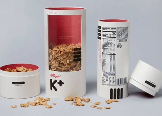
Cereal box design has come a long way over the years, evolving from simple and plain to colorful and playful.
Early Designs: Basic and Functional
In the early days of cereal packaging, boxes were mostly plain and utilitarian, designed mainly for function rather than aesthetics. They typically featured simple text and basic graphics to convey the brand and product information.
Introduction of Color and Imagery
As the world of advertising and marketing evolved, cereal companies began to recognize the importance of eye-catching packaging. Colorful designs and imagery were introduced to make cereal boxes stand out on the shelves and attract the attention of consumers.
Mascots and Characters
One of the biggest shifts in cereal box design came with the introduction of mascots and characters. Brands like Tony the Tiger for Frosted Flakes and Toucan Sam for Froot Loops became iconic symbols that helped establish brand recognition and loyalty.
Interactive Packaging
In recent years, cereal boxes have become even more interactive and engaging. Many brands now include games, puzzles, and other activities on their boxes to appeal to children and create a fun and memorable experience.
Limited Editions and Collector’s Items
Some cereal boxes have even become collector’s items, with limited edition designs released for special occasions or collaborations. These unique boxes can often fetch high prices among collectors.
The Future of Cereal Box Design
As technology continues to advance, we can expect to see even more innovative and creative designs in the world of cereal packaging. Brands will likely continue to push the boundaries of what is possible, creating even more exciting and playful designs to capture the attention of consumers.

